Welcome to my article “How to Design Instagram Posts That Get More Engagement”.
Instagram isn’t just about pretty pictures anymore—it’s a battleground for attention. With millions of posts flooding the platform every day, how do you make sure your content doesn’t get lost in the endless scroll? The answer: eye-catching design that stops thumbs mid-scroll and makes people want to engage. Whether you’re a business owner, a content creator, or just someone who wants more than three likes (one of them being your mom), designing engaging Instagram posts is the key to standing out.
But here’s the thing—good design isn’t just about slapping on a fancy font and hoping for the best. It’s about using color psychology, typography, layout techniques, and strategic placement of text and images to guide your audience’s eyes and emotions. It’s also about playing nice with Instagram’s algorithm (which, let’s be honest, feels like an unpredictable friend who changes moods daily). In this guide, we’ll break down five essential design strategies that will not only make your posts look stunning but also boost likes, shares, comments, and saves. Get ready to turn your Instagram feed into an engagement magnet—no design degree required.
My Best Recommended & Proven Way to Make $100-$300 Daily – Watch This FREE Video to START >>>

Choosing the Right Colors and Aesthetics
Let’s be real—color matters. You wouldn’t wear neon green to a job interview (unless you’re applying to be a highlighter), so why would you throw random colors together on your Instagram feed? Colors set the mood, create brand recognition, and, most importantly, make people stop and look. Studies show that color influences up to 90% of a person’s first impression—so yes, picking the right shades is kind of a big deal.
Color Psychology: What Vibes Are You Giving Off?
Ever wondered why fast-food brands love red and yellow? It’s because those colors trigger hunger and excitement (aka, the “I suddenly need fries” effect). Similarly, blue conveys trust, green feels fresh, and black screams luxury. The key is to choose colors that match your brand personality and the emotions you want your audience to feel. Selling eco-friendly products? Stick to greens and earthy tones. Want to appear fun and energetic? Bright, bold colors are your best friends.
Consistency is Key (No One Likes a Messy Feed)
Your Instagram aesthetic isn’t just about a single post—it’s about the vibe of your whole profile. Random, mismatched colors can make your feed look cluttered, while a consistent palette creates a clean, professional look that builds trust. Choose 3-5 core colors and use them consistently across posts, Stories, and highlights. Tools like Canva’s Brand Kit or Adobe Color can help you build a palette that reflects your brand.
Trending Aesthetics vs. Your Own Style
Yes, pastel aesthetics are trendy. Yes, minimalism is sleek. But don’t just hop on a trend because it’s popular—your aesthetic should feel authentic to your brand. Experiment with different styles, whether it’s bold and vibrant, soft and dreamy, or edgy and monochrome. The goal? Make your posts instantly recognizable, so your audience knows it’s you before even seeing your handle.
At the end of the day, the right color choices can make the difference between someone scrolling past or stopping to engage. So, choose wisely—because in the world of Instagram, first impressions happen in milliseconds.
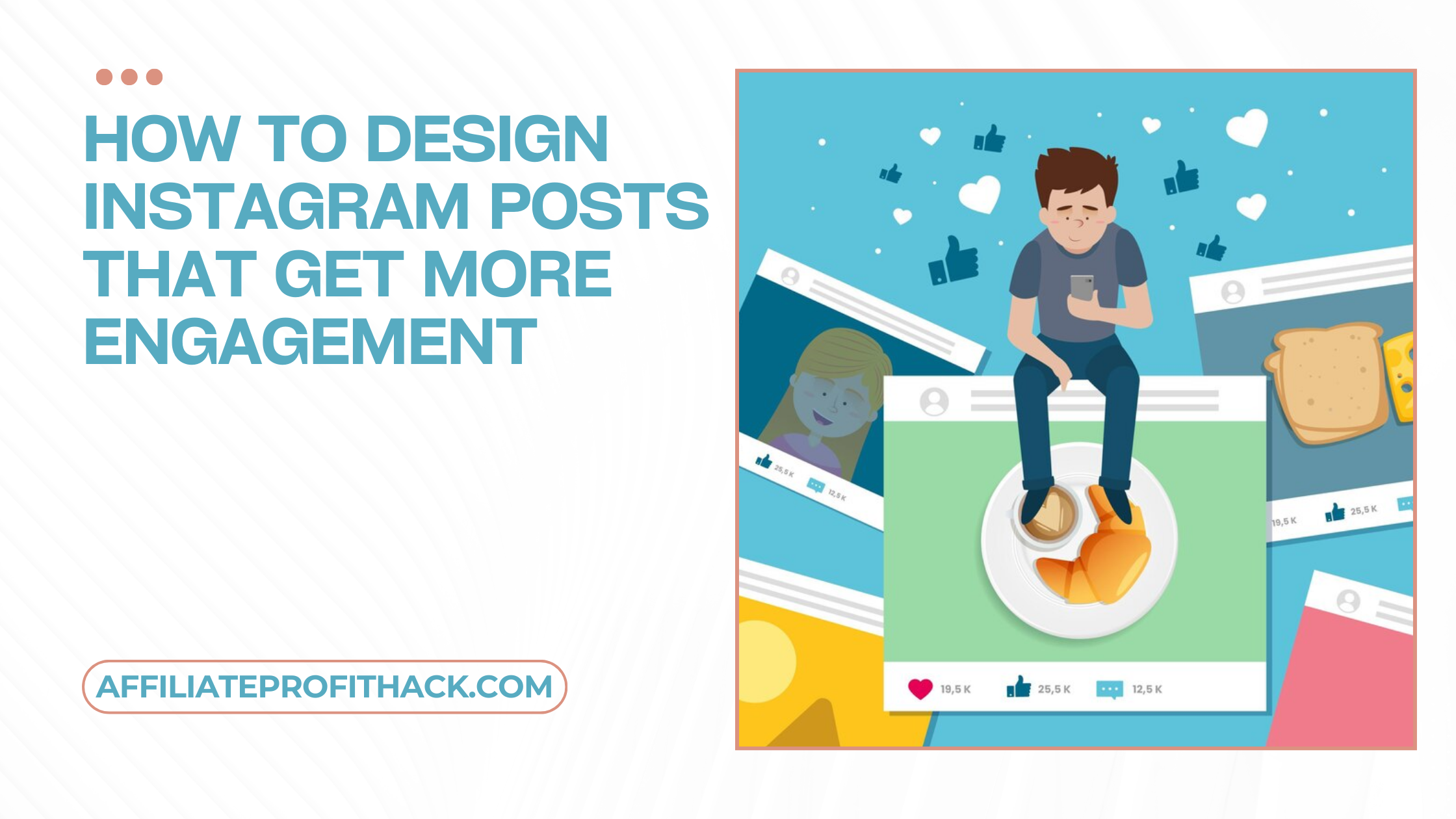
Creating Eye-Catching and Scroll-Stopping Visuals
Instagram is basically a never-ending competition for attention. One second, someone’s scrolling past vacation pics, then suddenly—boom—a cat in sunglasses shows up, and they just have to stop and double-tap. That’s exactly what you need to do with your visuals: make people pause, take notice, and engage. But how do you do that without resorting to posting cats in sunglasses? (Though, let’s be honest, that would work.)
Use High-Quality Images & Graphics (Blurry Pics Are a No-Go)
You wouldn’t show up to a business meeting in wrinkled pajamas, so why would you post low-quality, pixelated images? Your visuals should be crisp, clear, and visually appealing. Whether you’re using professional photos, stock images, or graphics, make sure they’re high-resolution. If you’re taking your own photos, good lighting is everything—natural light is your best friend.
Composition & Layout: Guide the Eyes Like a Pro
A great visual isn’t just about what you show—it’s about how you arrange it. The Rule of Thirds (imagining your image divided into a 3×3 grid and placing key elements at the intersections) can make your design look more balanced and natural. Symmetry and leading lines also help guide the viewer’s eyes exactly where you want them. Basically, you’re the director, and your audience’s eyeballs are your actors—make them look where you want.
My Best Recommended & Proven Way to Make $100-$300 Daily – Watch This FREE Video to START >>>
The Power of Contrast & Readability
Ever seen an Instagram post with text that blends so perfectly into the background that you need a magnifying glass to read it? Don’t be that person. High contrast (like dark text on a light background or vice versa) ensures your message pops. Also, don’t be afraid of whitespace—it makes your content feel clean and easy to read.
Templates Are Your Secret Weapon
If designing posts from scratch feels overwhelming, use templates. Tools like Canva and Adobe Express offer ready-made Instagram post templates that look professional and save you hours of work. Just tweak the colors, fonts, and text to match your brand, and boom—you’ve got a polished post in minutes.
At the end of the day, your visuals should be attention magnets. If people stop scrolling, you’ve won half the battle. Now, just make sure they actually engage (but we’ll get to that part next.
Writing Engaging Text & Typography Tips
You have nailed the visuals—your post is looking sleek, stylish, and totally scroll-stopping. But wait! If your text is a mess, all that design magic goes to waste. Think of text as the sidekick to your visuals—the Robin to your Batman. It might not be the first thing people notice, but it plays a huge role in keeping them engaged. So, let’s talk about making your text work for you, not against you.
Keep It Short, Bold & Impactful
Nobody opens Instagram thinking, Wow, I really hope I see a long-winded essay today! People skim, so your text needs to be short, punchy, and to the point. Instead of saying:
❌ “Check out our new summer collection, featuring lightweight, stylish, and comfortable outfits perfect for any occasion.”
Try:
✅ “New summer styles: Light, stylish & made for you. Tap to shop!”
See the difference? Less fluff, more impact.
Choose the Right Fonts (Because Comic Sans is Never the Answer)
Fonts have personalities. Some are sleek and modern, others are playful and fun, and some (looking at you, Papyrus) should just retire already. Stick to clean, readable fonts that match your brand’s vibe.
- Elegant & Luxury? Try Serif fonts (like Playfair Display).
- Modern & Minimalist? Sans-serif fonts (like Montserrat) are your go-to.
- Fun & Playful? Handwritten fonts (like Pacifico) add personality—but don’t overdo it.
Most importantly: don’t mix too many fonts. Two is a safe bet (one for headers, one for body text). More than that, and your post starts looking like a ransom note.
Hierarchy & Alignment: Make It Easy to Read
Your text should flow naturally. Use different font sizes and weights to guide the eye.
- Headlines: Big, bold, and easy to spot.
- Subtext: Smaller but still readable.
- CTAs: Make them stand out! “Swipe up,” “Tap to Shop,” “Double Tap if You Agree” should never be buried in tiny print.
Also, align your text properly. Centered text works well for quotes, but for other designs, left or right alignment often looks cleaner and more professional.
Use Hashtags & CTAs in Graphics (But Keep Them Subtle)
If hashtags and CTAs were people, they’d be the ones at a party who talk way too much. Yes, they’re important, but if you overdo it, they’ll ruin the vibe. Instead of cluttering your design with 15 hashtags, try placing one or two key ones subtly in the corner. The same goes for CTAs—make them noticeable, but don’t let them scream at your audience.
At the end of the day, your text should complement your visuals, not fight for attention. Keep it clean, readable, and engaging, and you’ll have people actually reading your posts instead of just scrolling past.
Optimizing for Instagram’s Algorithm
The Instagram algorithm—that mysterious, ever-changing force that decides whether your post gets seen by thousands… or buried in the void of irrelevance. It’s like playing a game where the rules keep changing, and Instagram never gives you the rulebook. But don’t worry, I’ve got the cheat codes! If you want your beautifully designed posts to actually reach people and get engagement, you need to play nice with the algorithm. Here’s how.
Use Instagram’s Preferred Image Dimensions (Because Cropped Posts Are a Crime)
Instagram loves specific aspect ratios. Use the wrong one, and your masterpiece could get cropped into oblivion. Here are the best sizes to use:
Square posts: 1080 x 1080 px (1:1) – A safe, classic choice.
Portrait posts: 1080 x 1350 px (4:5) – Takes up more screen space = more attention.
Landscape posts: 1080 x 566 px (1.91:1) – Looks great but doesn’t perform as well.
Reels & Stories: 1080 x 1920 px (9:16) – Full-screen, high-engagement gold.
If you’re not optimizing for these sizes, Instagram will crop your post in the most awkward way possible. Don’t give the algorithm an excuse to sabotage your content!
My Best Recommended & Proven Way to Make $100-$300 Daily – Watch This FREE Video to START >>>
Post Content That Encourages Engagement (AKA Algorithm Bait)
Instagram prioritizes posts that spark meaningful interactions. In other words, it wants people to spend more time on your post. So, your design should make people:
Comment – Ask a question in your caption or use polls in Stories.
Save – Infographics, tips, and guides get tons of saves.
Share – Relatable memes, quotes, and industry insights get reshared like wildfire.
Like – High-quality, visually striking images always perform well.
The trick? Design your post to subtly guide engagement. Add a call-to-action like “Double tap if you agree!” or “Tag a friend who needs to see this”. A simple nudge can go a long way.
Use Stickers & Interactive Features in Stories
Instagram loves it when you use its features. Polls, quizzes, sliders, question boxes—these aren’t just fun; they boost your visibility. The more people interact with your Stories, the more likely Instagram is to show them your future posts.
Bonus tip: If you really want to boost engagement, use the “Add Yours” sticker in Stories. This feature lets followers participate in a trend, increasing shares and engagement. Plus, Instagram pushes these posts hard.
Timing & Frequency: Post When Your Audience is Actually Online
You could create the most stunning, engaging post ever, but if you post it when your audience is asleep, what’s the point? The best times to post vary, but here’s a general guide:
Best Days to Post: Tuesday, Wednesday, and Thursday.
Best Times to Post: Between 9 AM – 11 AM and 6 PM – 9 PM (aka when people aren’t working).
Of course, the real goldmine is in your Instagram Insights. Check when your audience is most active and post accordingly.
Consistency is Key (But Don’t Spam!)
Instagram rewards accounts that post consistently. Aim for:
✔️ 3-5 feed posts per week (including carousels & reels).
✔️ Daily Stories (because Stories = more engagement).
✔️ At least 1 Reel per week (Instagram is obsessed with video right now).
The goal is to stay visible without overwhelming your followers. Quality > quantity—so don’t post just for the sake of posting.
Adding Motion & Animation for More Engagement
Static posts are great and all, but if you really want to grab attention, you need to add some motion to the mix. Think about it—when you’re scrolling through Instagram, what catches your eye more: a still image or a post that moves? Exactly. Motion naturally stops the scroll because it feels dynamic, alive, and engaging. And the best part? You don’t need to be a professional animator to make it happen. Let’s dive into how you can use animation to boost engagement without breaking a sweat.
Reels & Short Videos: Instagram’s Favorite Child
Instagram loves video content. In fact, the platform is pushing Reels so hard that even a simple 5-second clip can outperform a high-quality image post. If you’re not using Reels yet, here’s why you should start:
More Reach – Instagram prioritizes Reels in the Explore feed.
More Engagement – Users spend longer watching videos than static posts.
More Shares & Saves – Reels are easier to reshare, making them viral-friendly.
You don’t need fancy equipment—just use Instagram’s built-in tools, or apps like InShot or CapCut to edit quick, engaging clips. Add snappy text, smooth transitions, and trending audio to keep things lively.
Animated Text & Graphics: Small Movement, Big Impact
Even if you’re sticking to static posts, you can still add micro animations to make them more engaging. Apps like Canva, Mojo, and Adobe Express let you animate text, icons, and background elements with just a few clicks. Some easy ways to add motion:
Bouncing Text – Make headlines pop with subtle movement.
Fading Effects – Smooth transitions between elements keep eyes glued.
Swipe & Tap Animations – Guide your audience to take action.
A little movement goes a long way in making your post feel more interactive.
GIFs & Stickers in Stories: Easy but Effective
Instagram Stories are a goldmine for engagement, and adding GIFs & stickers makes them even more fun. Try using:
Moving Arrows – To direct attention to a CTA (like “Swipe Up” or “Tap Here”).
Reaction GIFs – To add personality and encourage responses.
Trending Stickers – Instagram regularly updates its sticker collection—use them to stay relevant.
Pro tip: Use the “Poll” or “Question” sticker with an animated element to encourage even more interactions.
Cinemagraphs: The Best of Both Worlds
If you want something really eye-catching, try cinemagraphs—those cool images where only one part of the photo moves (like a flickering candle or flowing water). These look sleek and professional but are surprisingly easy to create with apps like Pixaloop or Plotaverse. They give the illusion of video without being too distracting.
Stop-Motion & Looping Clips: Quirky & Fun
Stop-motion animations (where a series of images are stitched together to create movement) are super engaging and work great for product showcases, tutorials, or just adding personality to your brand. Instagram also loves boomerangs—those short, looping clips that play forward and backward.
Conclusion
At this point, you are basically an Instagram engagement wizard. ✨ You know how to design posts that pop, write text that grabs attention, and work the algorithm like a pro. You even know how to sneak in some motion magic to keep people hooked. So, what’s next?
Well, now comes the fun part—putting it all into action. Because let’s be real: Instagram isn’t just a pretty picture app anymore. It’s a battlefield for attention, and your goal is to stop the scroll, spark engagement, and make people care about your content.
So, let’s do a quick recap:
✅ Use bold colors & aesthetics to make your brand instantly recognizable.
✅ Create eye-catching visuals that demand attention.
✅ Write short, punchy text that gets the message across fast.
✅ Play nice with the algorithm by encouraging interaction.
✅ Add movement & animation to bring your posts to life.
The key takeaway? Instagram rewards creativity, consistency, and engagement. The more you experiment and refine your designs, the more you’ll see what actually works for your audience.
My Best Recommended & Proven Way to Make $100-$300 Daily – Watch This FREE Video to START >>>
Now go out there, create some scroll-stopping content, and give your followers a reason to double-tap, comment, and share. Who knows? Your next post might just be the one that breaks the internet (or at least gets a ton of likes).
Thank you for reading my article “How to Design Instagram Posts That Get More Engagement” till the end. Hope it helped you. See you with another article.